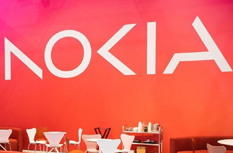
Espoo, Finland: Nokia announced plans to alter its brand identity for the first time in nearly 60 years, complete with a new logo while the manufacturer of telecom equipment concentrates on ambitious growth.
The word Nokia is represented by five different shapes in the new logo. Depending on the purpose, the previous logo’s signature blue colour has been replaced with a variety of colours. Chief Executive Mr. Pekka Lundmark devised a three-stage strategy in 2020 after assuming leadership of the faltering Finnish business. The stages were reset, accelerate, and scaled. Mr. Lundmark stated that the second stage has started now that the reset stage is over.
This is Nokia, but not as the world has seen us before. Our new brand signals who Nokia is today. We’re unleashing the exponential potential of networks and their power to help reshape the way we all live and work. https://t.co/lbKLfaL2OI #NewNokia pic.twitter.com/VAgVo8p6nG
— Nokia #MWC23 (@nokia) February 26, 2023
Nokia’s primary focus is now on selling equipment to other firms, though it still hopes to expand its service provider sector, where it sells equipment to telecom companies. Although it still intends to grow its service provider sector, where it sells equipment to telecom providers, Nokia’s primary focus right now is on selling equipment to other businesses.
Nokia intends to evaluate the development of each of its companies and explore all available options, including divestiture. Nokia will be competing against major tech firms like Microsoft and Amazon as they move towards data centres and factory automation.
With the development in low-margin India replacing demand from high-margin areas like North America, the market for telecom equipment is under strain, forcing competitor Ericsson to lay off 8,500 workers.


